The wrapped-website syndrome
An app that's just a website wrapped inside an app. That's exactly what triggers tons of Apple 4.2 rejections.
Your user decides in 7 seconds whether to keep or delete your app. Here is how to win that battle.
Your user just downloaded your app.
They open it. They look. They decide.
In 7 seconds.
That is all you get. 7 seconds to convince them your app deserves to stay on their phone. 71% of users uninstall an app within the first 90 days (Adjust, 2024). Most leave long before that.
In real life, they say "you never get a second chance to make a first impression."
For an app, it is 10 times more true.
Your user has their finger on the delete button. They have 150 other apps installed. Yours has no special privilege. It must prove its value immediately.
The most important factor: the user does not want to understand your app. They want your app to understand them.
Think about the last time you walked into a shop. If nobody greets you, if the shelves are a mess, if you cannot find what you need in 10 seconds, you leave. Your app is that shop. The first screen is the window display and the welcome desk rolled into one. It must say: "Welcome, here is exactly what you are looking for."
First screen: "Create your account. First name. Last name. Email. Password. Phone number. Date of birth."
The user has not even seen what you offer. And you are already asking for their life story.
Spoiler: they will not fill out that form. They leave.
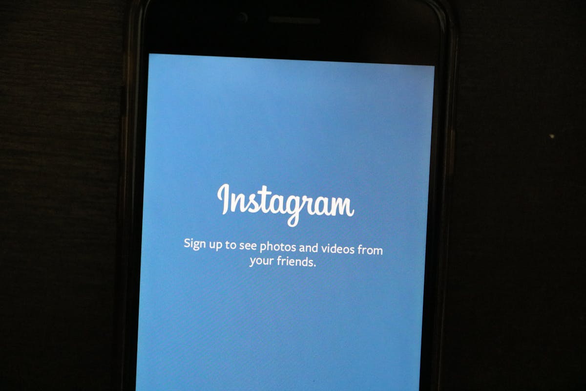
According to Apple's Human Interface Guidelines, you must show value before asking for anything. Let the user explore. The account can come later.
The best apps in the world already do this. They let you browse, discover, test. And when you are convinced, they politely ask you to create an account. Not before. Not at the front door. It is a matter of respect. You do not invite someone to dinner by asking for their social security number on the doorstep.
A good onboarding fits in 3 screens maximum:
That is it. No 12-page tutorial. No technical explanation. No premium plan mention.
If your app needs a user manual, the design has failed.
The key advantage of a well-designed app: the user understands everything without reading anything.
The home screen should contain one main action. One button. One gesture. One obvious direction.
The best apps in the world follow this rule. According to Google's Material Design standards, every screen should have one single, clear objective.
Think of a door. If you need to put a sign saying "Push" or "Pull," the door is poorly designed. Your app is the same.
Take a step back. Breathe. Run a simple test.
Show your first screen to 5 people who have never seen your app. No explanation. Just watch.
This test takes 30 minutes. It costs nothing. And it can save you months of development heading in the wrong direction. Do it before every major update. Do it with people who know nothing about your industry. The further they are from your world, the more valuable their feedback becomes.
In short: your first screen is not a showcase. It is a handshake. It must be firm, quick, and make people want to stay.
Not sure about your first screen? Book a 15-minute call for an outside perspective.
12 years of experience, iOS + Android, one dedicated contact. Free 15-minute call to scope your need — no commitment, no jargon.
Book a call →
Your user just downloaded your app.
They open it. They look. They decide.
In 7 seconds.
That is all you get. 7 seconds to convince them your app deserves to stay on their phone. 71% of users uninstall an app within the first 90 days (Adjust, 2024). Most leave long before that.
In real life, they say "you never get a second chance to make a first impression."
For an app, it is 10 times more true.
Your user has their finger on the delete button. They have 150 other apps installed. Yours has no special privilege. It must prove its value immediately.
The most important factor: the user does not want to understand your app. They want your app to understand them.
Think about the last time you walked into a shop. If nobody greets you, if the shelves are a mess, if you cannot find what you need in 10 seconds, you leave. Your app is that shop. The first screen is the window display and the welcome desk rolled into one. It must say: "Welcome, here is exactly what you are looking for."
First screen: "Create your account. First name. Last name. Email. Password. Phone number. Date of birth."
The user has not even seen what you offer. And you are already asking for their life story.
Spoiler: they will not fill out that form. They leave.
According to Apple's Human Interface Guidelines, you must show value before asking for anything. Let the user explore. The account can come later.
The best apps in the world already do this. They let you browse, discover, test. And when you are convinced, they politely ask you to create an account. Not before. Not at the front door. It is a matter of respect. You do not invite someone to dinner by asking for their social security number on the doorstep.
A good onboarding fits in 3 screens maximum:
That is it. No 12-page tutorial. No technical explanation. No premium plan mention.
If your app needs a user manual, the design has failed.
The key advantage of a well-designed app: the user understands everything without reading anything.
The home screen should contain one main action. One button. One gesture. One obvious direction.
The best apps in the world follow this rule. According to Google's Material Design standards, every screen should have one single, clear objective.
Think of a door. If you need to put a sign saying "Push" or "Pull," the door is poorly designed. Your app is the same.
Take a step back. Breathe. Run a simple test.
Show your first screen to 5 people who have never seen your app. No explanation. Just watch.
This test takes 30 minutes. It costs nothing. And it can save you months of development heading in the wrong direction. Do it before every major update. Do it with people who know nothing about your industry. The further they are from your world, the more valuable their feedback becomes.
In short: your first screen is not a showcase. It is a handshake. It must be firm, quick, and make people want to stay.
Not sure about your first screen? Book a 15-minute call for an outside perspective.
12 years of experience, iOS + Android, one dedicated contact. Free 15-minute call to scope your need — no commitment, no jargon.
Book a call →We write about mobile app development, user experience design, App Store optimization, project management, and industry trends. Our articles are based on real experience from client projects.
We aim to publish regularly with a focus on quality over quantity. Each article is written from hands-on experience, not generic advice.
Absolutely! Feel free to reach out via our contact page or book a consultation. We love hearing what questions our readers and clients have.