The fake "perfect button"
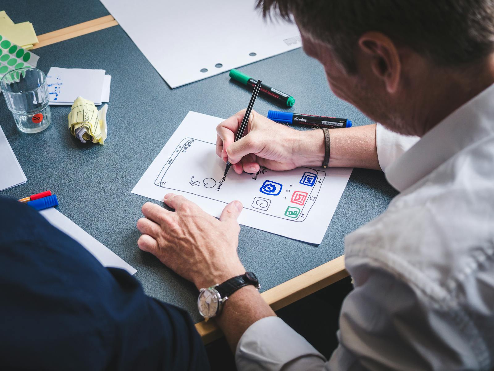
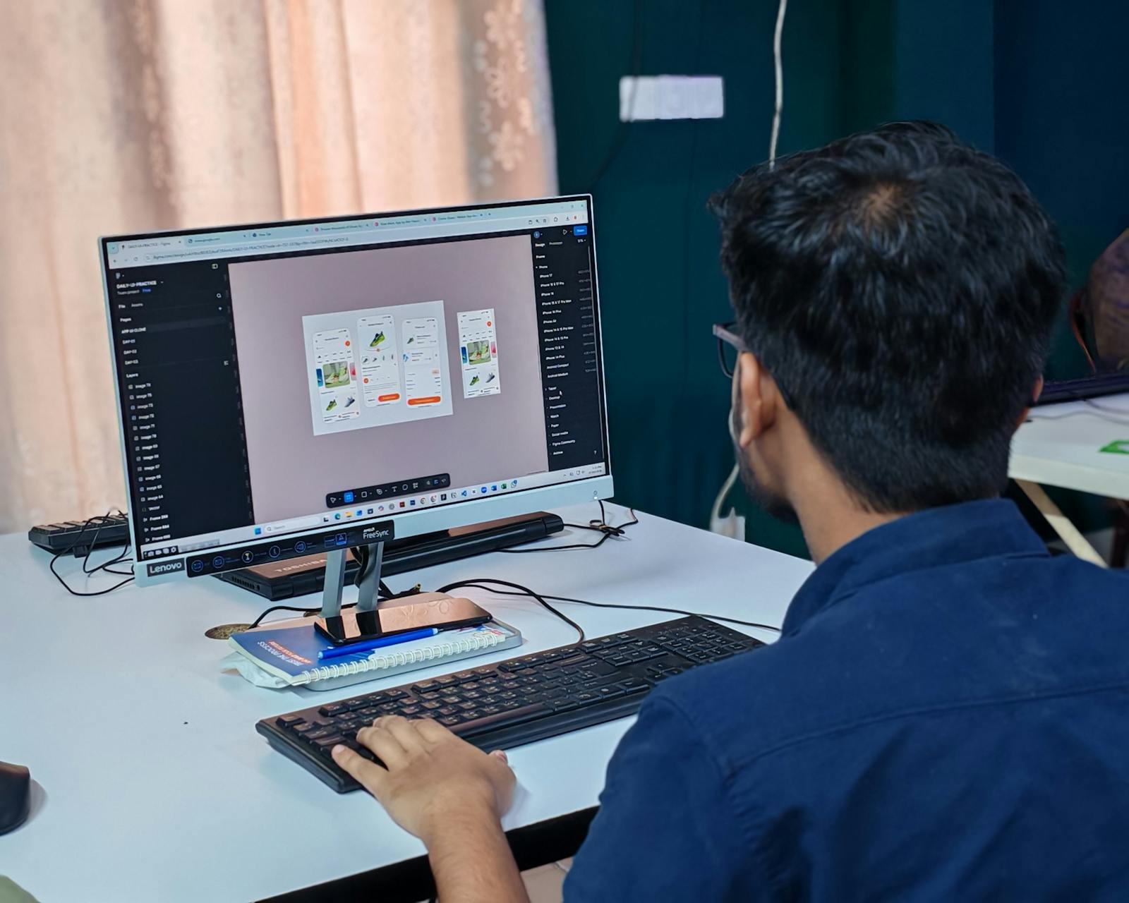
"Let's redo the button again." Meanwhile, the real product problem stays elsewhere. The product is trying to look prett…
Booking is extremely effective. But constant pressure — "only 1 room left", "booked 14 times today" — pushes cognitive fatigue up.
Booking is extremely effective. The app pushes you to book fast. To compare. To decide. To act. And honestly, it works very well.
But many users also feel something else : fatigue. Why ?
Because Booking leans heavily on urgency. "Only 1 room left." "Booked 14 times today." "5 people viewing this hotel." "Offer expiring soon."
Pressure works until it becomes noise, and there is good evidence for where that line sits. A study of 197 million notifications from 40,191 users found that people "actively disabled 5.51% of all apps that raise notifications on their phone", and that "frequency of notifications when the information given is not perceived as important, is a crucial factor that leads to increased blacklisting" (Sahami Shirazi et al., CHI, 2014).
The key difference is between a message that carries an event and a message that manufactures one. In the same study, notifications about a real event were rated 4.07 out of 5 for importance, while frequency-driven complaints scored 1.45. Users do not resent being told something. They resent being told nothing, often.
The brain constantly receives signals : "Decide fast." And psychologically, it's very powerful. Because humans hate the feeling of losing an opportunity.
The problem is that with constant pressure… cognitive fatigue rises enormously.
And it's something many apps copy today : too many popups, too many notifications, too much artificial urgency, too many choices everywhere.
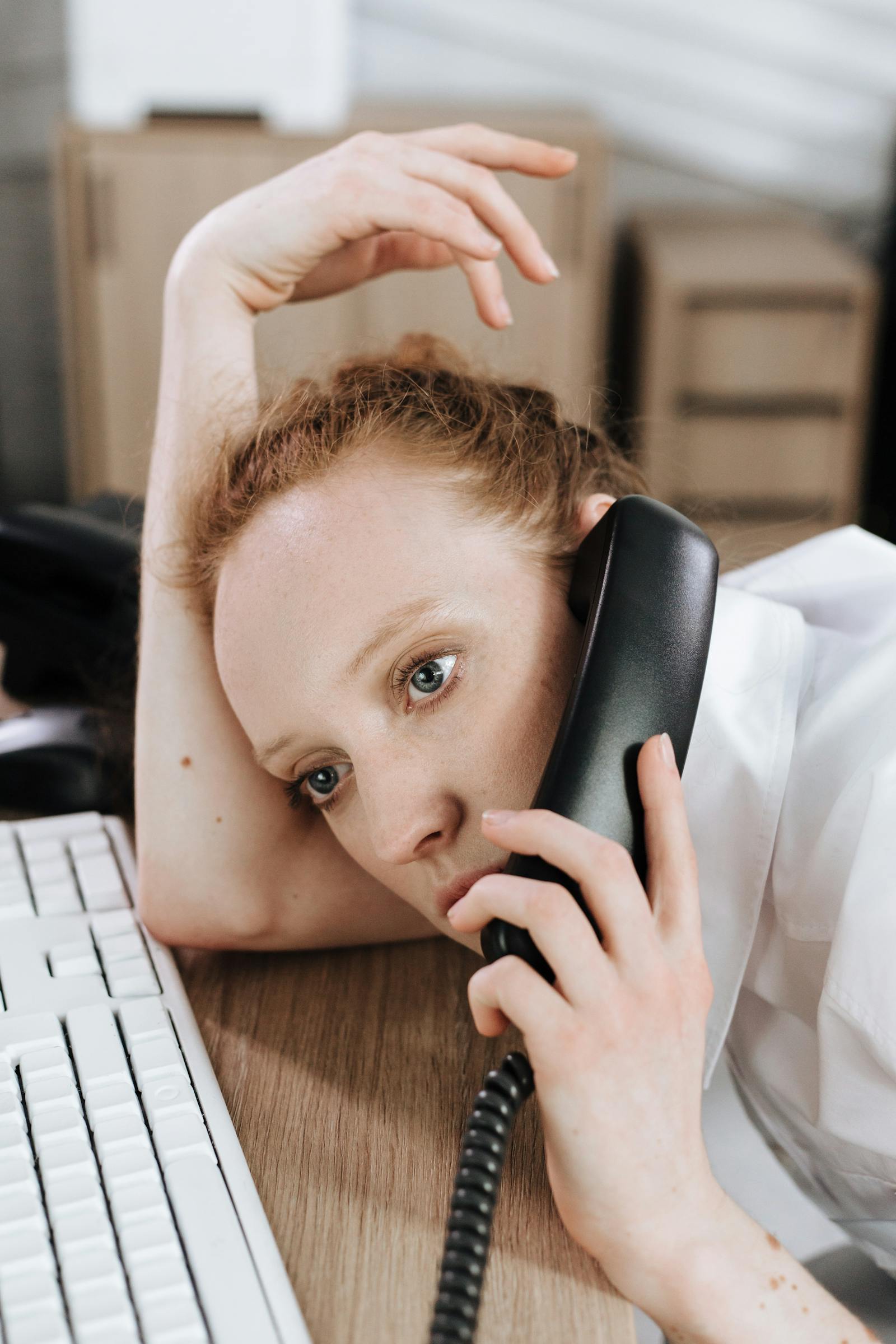
The brain starts to saturate. The user compares. Scrolls. Hesitates. Sometimes abandons completely.
According to the Nielsen Norman Group, decision fatigue reduces the ability to choose and can even trigger flight behavior. Too much urgency kills urgency.
A good app shouldn't only push to action. It should also know how to calm the user. Help them understand. Help them choose. Help them breathe through the noise.
Because an app can be very performant… and yet mentally exhausting. And on mobile, that fatigue hits fast.
The best products know how to find a balance : enough urgency to help decide, but not enough to create constant stress.
And honestly, that balance is extremely hard to find.
Is your app pushing too hard, to the point of wearing users out ? Book a 30-minute call to rebalance the psychological pressure before it turns against you.
12 years of experience, iOS + Android, one dedicated contact. Free 30-minute call to scope your need — no commitment, no jargon.
Book a call →
Booking is extremely effective. The app pushes you to book fast. To compare. To decide. To act. And honestly, it works very well.
But many users also feel something else : fatigue. Why ?
Because Booking leans heavily on urgency. "Only 1 room left." "Booked 14 times today." "5 people viewing this hotel." "Offer expiring soon."
Pressure works until it becomes noise, and there is good evidence for where that line sits. A study of 197 million notifications from 40,191 users found that people "actively disabled 5.51% of all apps that raise notifications on their phone", and that "frequency of notifications when the information given is not perceived as important, is a crucial factor that leads to increased blacklisting" (Sahami Shirazi et al., CHI, 2014).
The key difference is between a message that carries an event and a message that manufactures one. In the same study, notifications about a real event were rated 4.07 out of 5 for importance, while frequency-driven complaints scored 1.45. Users do not resent being told something. They resent being told nothing, often.
The brain constantly receives signals : "Decide fast." And psychologically, it's very powerful. Because humans hate the feeling of losing an opportunity.
The problem is that with constant pressure… cognitive fatigue rises enormously.
And it's something many apps copy today : too many popups, too many notifications, too much artificial urgency, too many choices everywhere.
The brain starts to saturate. The user compares. Scrolls. Hesitates. Sometimes abandons completely.
According to the Nielsen Norman Group, decision fatigue reduces the ability to choose and can even trigger flight behavior. Too much urgency kills urgency.
A good app shouldn't only push to action. It should also know how to calm the user. Help them understand. Help them choose. Help them breathe through the noise.
Because an app can be very performant… and yet mentally exhausting. And on mobile, that fatigue hits fast.
The best products know how to find a balance : enough urgency to help decide, but not enough to create constant stress.
And honestly, that balance is extremely hard to find.
Is your app pushing too hard, to the point of wearing users out ? Book a 30-minute call to rebalance the psychological pressure before it turns against you.
12 years of experience, iOS + Android, one dedicated contact. Free 30-minute call to scope your need — no commitment, no jargon.
Book a call →We write about mobile app development, user experience design, App Store optimization, project management, and industry trends. Our articles are based on real experience from client projects.
We aim to publish regularly with a focus on quality over quantity. Each article is written from hands-on experience, not generic advice.
Absolutely! Feel free to reach out via our contact page or book a consultation. We love hearing what questions our readers and clients have.
Most of my projects run remotely, and in practice that changes very little. We talk over video whenever you need to, not only at major milestones, and you can reach me with questions at any point during the project — I always answer.
You can also write to me directly on WhatsApp: same number I use every day, a French professional line that works internationally.