The wrapped-website syndrome
An app that's just a website wrapped inside an app. That's exactly what triggers tons of Apple 4.2 rejections.
 Mickael Romaniello
30 minutes, no slides, nothing to prepare.
Mickael Romaniello
30 minutes, no slides, nothing to prepare.
Uber Eats, Deliveroo, DoorDash — these apps didn't win on price or restaurant selection. They won on user experience decisions that every mobile product can learn from.
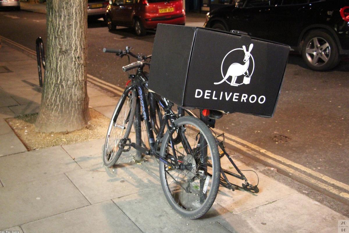
Food delivery apps are one of the clearest case studies in mobile product success. They operate in a brutally competitive market with nearly identical offerings — restaurants, prices, and delivery times are all roughly comparable across platforms. Yet user loyalty is strong. The reason is not the food; it is the product experience. Understanding what makes these apps work teaches lessons that apply to almost any mobile business.
The moment you place a food order, a clock starts in your head. You start wondering when it will arrive, whether the driver found the restaurant, and whether your food will still be warm. The best delivery apps identified this anxiety early and built their entire experience around eliminating it. Live GPS tracking of the delivery driver, timestamped status updates ("your order is being prepared," "driver picked up your order"), and accurate ETA displays are not features — they are anxiety management tools.
The lesson extends far beyond food delivery. Any app with a waiting period — a service booking, a shipping confirmation, a support ticket — improves markedly by adding real-time status visibility. Users tolerate delays they understand and escalate the ones they do not.
The thresholds involved are well established and older than the smartphone. "0.1 second is about the limit for having the user feel that the system is reacting instantaneously", "1.0 second is about the limit for the user's flow of thought to stay uninterrupted", and "10 seconds is about the limit for keeping the user's attention focused on the dialogue" (Nielsen, 1993, after Miller, 1968). Past that last one, people need an estimate of when the wait ends — which is precisely what a delivery ETA is.
The key difference between a good delivery app and a bad one is not the length of the wait, which neither controls. It is whether the 30 minutes are narrated or silent.
The most powerful retention feature in food delivery apps is the reorder button. Placing a repeat order takes two taps. Your previous address, payment method, and even specific item customizations are saved. This is not a convenience feature — it is a deliberate design decision to make the value of loyalty immediately tangible. The longer you use the app, the more personalized and frictionless it becomes, which makes switching to a competitor feel like starting from scratch.
This principle — reducing friction for returning users more aggressively than for new users — is underused in most mobile products. Most apps optimize the onboarding experience intensely and then ignore the repeat-user experience. Delivery apps inverted this priority and it is a major reason for their retention numbers.
You do not need to build a logistics platform to apply these lessons. The core insights are simple. First: identify the moments where your users feel uncertain or anxious, and build transparency features that address those moments directly. Second: find the actions your most loyal users repeat most often and reduce the friction on those actions specifically. Third: make the value of continued use visible and tangible, so that switching cost is felt rather than just assumed.
These are product engineering decisions made at the design stage, not afterthoughts added once an app already has users. I help businesses think through these patterns during product definition, before a line of code is written.
Want to apply delivery-app UX thinking to your product? Let's design it together.
12 years of experience, iOS + Android, one dedicated contact. Free 30-minute call to scope your need — no commitment, no jargon.
Book a call →
Food delivery apps are one of the clearest case studies in mobile product success. They operate in a brutally competitive market with nearly identical offerings — restaurants, prices, and delivery times are all roughly comparable across platforms. Yet user loyalty is strong. The reason is not the food; it is the product experience. Understanding what makes these apps work teaches lessons that apply to almost any mobile business.
The moment you place a food order, a clock starts in your head. You start wondering when it will arrive, whether the driver found the restaurant, and whether your food will still be warm. The best delivery apps identified this anxiety early and built their entire experience around eliminating it. Live GPS tracking of the delivery driver, timestamped status updates ("your order is being prepared," "driver picked up your order"), and accurate ETA displays are not features — they are anxiety management tools.
The lesson extends far beyond food delivery. Any app with a waiting period — a service booking, a shipping confirmation, a support ticket — improves markedly by adding real-time status visibility. Users tolerate delays they understand and escalate the ones they do not.
The thresholds involved are well established and older than the smartphone. "0.1 second is about the limit for having the user feel that the system is reacting instantaneously", "1.0 second is about the limit for the user's flow of thought to stay uninterrupted", and "10 seconds is about the limit for keeping the user's attention focused on the dialogue" (Nielsen, 1993, after Miller, 1968). Past that last one, people need an estimate of when the wait ends — which is precisely what a delivery ETA is.
The key difference between a good delivery app and a bad one is not the length of the wait, which neither controls. It is whether the 30 minutes are narrated or silent.
The most powerful retention feature in food delivery apps is the reorder button. Placing a repeat order takes two taps. Your previous address, payment method, and even specific item customizations are saved. This is not a convenience feature — it is a deliberate design decision to make the value of loyalty immediately tangible. The longer you use the app, the more personalized and frictionless it becomes, which makes switching to a competitor feel like starting from scratch.
This principle — reducing friction for returning users more aggressively than for new users — is underused in most mobile products. Most apps optimize the onboarding experience intensely and then ignore the repeat-user experience. Delivery apps inverted this priority and it is a major reason for their retention numbers.
You do not need to build a logistics platform to apply these lessons. The core insights are simple. First: identify the moments where your users feel uncertain or anxious, and build transparency features that address those moments directly. Second: find the actions your most loyal users repeat most often and reduce the friction on those actions specifically. Third: make the value of continued use visible and tangible, so that switching cost is felt rather than just assumed.
These are product engineering decisions made at the design stage, not afterthoughts added once an app already has users. I help businesses think through these patterns during product definition, before a line of code is written.
Want to apply delivery-app UX thinking to your product? Let's design it together.
12 years of experience, iOS + Android, one dedicated contact. Free 30-minute call to scope your need — no commitment, no jargon.
Book a call →We write about mobile app development, user experience design, App Store optimization, project management, and industry trends. Our articles are based on real experience from client projects.
We aim to publish regularly with a focus on quality over quantity. Each article is written from hands-on experience, not generic advice.
Absolutely! Feel free to reach out via our contact page or book a consultation. We love hearing what questions our readers and clients have.
Most of my projects run remotely, and in practice that changes very little. We talk over video whenever you need to, not only at major milestones, and you can reach me with questions at any point during the project — I always answer.
You can also write to me directly on WhatsApp: same number I use every day, a French professional line that works internationally.